
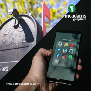
When sorting through your mailbox, what is the first thing that catches your eye? It’s not the near-identical stack of white envelopes filled with bills and letters. Instead, it’s the colorful piece of direct mail.
The same is true for your consumer audience. As they sort through their mail, you want your direct mail to stand out and capture their attention. One of the easiest ways to quickly captivate your audience is by using color for your direct mail campaign. Color can ‘make’ your direct mail — as long as you are intentional with your color design. Selecting a color at random or one that’s off-brand, or using too much color altogether, can just as easily ‘break’ your campaign and limit your success.
You have to carefully consider the impact your color choices will have. With the right color and amount of color, you’ll create a memorable, lasting impression of your brand for your target audience. Color has even been shown to improve consumer response rates.
Here are 5 tips for adding color to your direct mail piece, and how they can improve the success of your campaign:
1. Use Colors That Complement Your Brand
Every marketing material is meant to represent your brand, and direct mail is no exception. When designing your direct mailer, you want to select colors that match or complement your branding colors. Branding colors often include the colors you use in your logo, in your letterhead, and on your website. By using the same colors in your direct mail, you remain consistent with the rest of your brand. This helps your audience recognize your brand more easily from your direct mail and make the connection between your mailer and your brand’s presence on other channels. Moreover, it’s easier for your audience to trust you and your brand if they see you as being consistent.
Do: Don’t:

2. Different Colors Elicit Different Feelings
Different colors often evoke specific emotions, and you can use this to your advantage by choosing the color — and emotion — that aligns with your brand strategy and marketing goals. There are a number of resources on the psychology of color, but here are a few examples of colors and what different colors can imply to your audience:
- Blues are associated with trustworthy products.
- Green and brown signify sustainability.
- Red and pink are attention-grabbing colors, but can also signify love.
- Gold and purple are indicators of wealth.
- Orange and yellow are warm, cheerful colors.
Fostering certain emotions with color can help you achieve your marketing goals because you can influence the emotions your audience associates with your brand. That’s why it’s important to consider what type of emotions your color choices will indicate — it has a direct effect on how your brand is perceived by your audience.
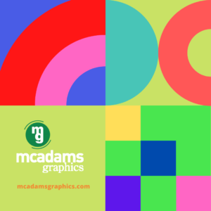
3. Images Count When it Comes to Color
Remember to think outside of the box, or color block, when it comes to incorporating color into your direct mail piece. A colorful image can just as easily capture a reader’s attention, and the particular color scheme within the image may also influence how they perceive you and your brand. Like other elements of color, your image and its colors should complement your brand, and align with your overall marketing strategy.
4. Less is More
While color is useful in capturing your audience’s attention, it can also be overdone. Using more colors than you need, especially if they’re off-brand, can do more harm than good. Overusing one color or using the wrong colors may create a negative impression of your brand.
As soon as you have your colors in mind, make sure to evaluate whether they all complement one another and look the way you want on your direct mailer. One useful strategy is to use one primary color and one or two secondary colors that are consistent with your branding. Rainbows are beautiful, but not always when it comes to direct mail. Creating the proper balance between colors is crucial to developing a mailer that successfully achieves your marketing goals.
Do: Don’t:
5. Color Lends Itself to A/B Testing
The benefit of conducting an A/B test is that you understand which mailer will get the best response from your target audience. Luckily, color is a simple — and often effective — variable to change in an A/B test. Between mailer A and mailer B, you’ll see which colors and color images resonate most with your audience, and which garner the most response. This allows you to maximize your results in your next direct mail campaign.
Mailer A: Mailer B:


Find Your Printing Partner
There are endless possibilities when it comes to color design and direct mailers. Bottom line? Color can make a difference in the results of your direct mail campaign, and you want to make the right color choice to see the improvement in response rates and more. That’s why it’s crucial to find a printing partner that understands how to best use color to support your brand’s marketing efforts. Contact McAdams Graphics today to learn how we can help you make the right color choices for your next direct mail campaign.